This project was to replica a architects design. When looking for a design to do I thought to find something that of out
of ordinary. I found many designs that I like but when looking at these
Cube house in Rotterdam, Netherlands. I thought to myself they look cool
and should be fun and easy to do. Well to my surprise it wasn't that
easy to do even though there is a lot of straight lines in this there is
also a lot of detail from the roof to the concrete. The windows with all
the reflections of the other building in them. Also when looking at the photo notice the roof of the one building is not there. I was able to create the rest of the roof for the picture. It took a while to do but
was definitely worth the time. Kubuswoningen, or cube houses, are a set
of innovative houses built in Rotterdam and Helmond in the Netherlands,
designed by architect Piet Blom and based on the concept of "living as a
urban roof". High density housing with sufficient space on the ground
level. Blom titled the cube of a conventional house 45 degrees, a rested
it upon a hexagon-shaped pylon. His design represents a village within a
city, where each house represents a tree, and all the houses together, a
forest.
work cited http://en.wikipedia.org/wiki/Cube_house
Total Pageviews
Tuesday, August 13, 2013
Typohgraphy Portraits
This typography project, we had to do two of the pictures as self portraits and the other we were able to pic whoever. For my Line and Shape portraits I did portraits of myself. My Value picture was done of my 18 month old son.
Shape- This was all done to mimic the photo only using letters and shapes to capture the picture
Line- Each line in this self portrait has loving words for my Fiance Rachel. Not only that but has my kids birthdays and favorite things we like to do as a family to make up each line
.
Value- For my value piece i chose my youngest son. From his shirt to his face it all has three words, LIVE, LAUGH, LOVE.
Logo Project
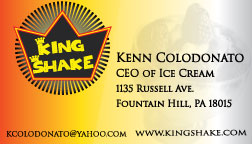
LOGO PROJECT. In this project we had to create a logo for a ice cream kiosk station. The logo was to be simple and was needed to be printed on cups, napkins,hats,etc. The customer wanted the colors to be Red, Yellow, Black, and White. After making almost twenty logos I was able to narrow it down to this logo and was able to tweak it to a version that many people have come to like.
The Logo, in color and black and white,
Stationary Paper, This is what you would receive if a letter was sent to you from this company,
Next Would be the Envelope,
The Business card.
The Logo, in color and black and white,
Stationary Paper, This is what you would receive if a letter was sent to you from this company,
Next Would be the Envelope,
The Business card.
Web SIte Interface
Web Site Interface was our third project. We had to take the original website of www.spiritfeathers.com and up date its appearance. I used a few different texture with the leather on background of the title. While using a unique piece of driftwood for the side bars.
Dreamscape
Our 2nd project was a Dreamscape. Salvador Dali a surrealist painter he would come up with unigue ideas and images to make things out of the ordinary. This is my version of a Dreamscape. I really enjoy playing golf and getting my mind off of things going on in the real world. I am a really big fan of beautiful colors that is why i picked my original photo also i like the landscape that is out in the west. This is a picture from Utah. Then I found this picture of this stone pit, I thought it would be a great place to tee off in the middle of the rocky desert. Seeing I like golf very relaxing sport " SOMETIMES" so I found a picture of Ricki Fowler who I like. Stuck him in this desert paradise golf setting. It looks like something straight out of a Tiger Woods 13' golf video game. Also the big moon is to represent our Super Moon that only happens once a year. This is what i think when someone says super moon.
Magazine Project
This was our first project in my Computer Graphics class. Using Photoshop to create a magazine cover for anything of our choice. I chose to do a Tattoo Magazine. I am very fond of tattoos and have many myself, it felt right to make a magazine for that. I felt that having the color of the tattoos in color and the model in black and white would set off the magazine amongst the rest of magazines of its same content on stands.
Subscribe to:
Comments (Atom)


